For decades, businesses have refreshed logos, straplines and more recently websites. Sporting teams have done it too over the years, some to greater success than others. However sport evokes a passion in people that most companies can only dream of. So from something as simple as redesigning a club badge to changing a club name, it seems like 99% of the time it’s much easier to get it wrong than right.
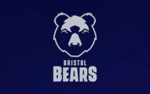 The latest example is the rugby club formerly known as Bristol Rugby. The very bold and forward-thinking Bristol Sports Group, who also owns Bristol City FC (the football team with those magnificent goalscorer gifs that have gone viral all of this season) has taken the plunge and decided to rebrand the perennial yo-yo club of English rugby. Following their recent promotion back to English Rugby’s top table, Bristol Rugby announced that they’d be re-branding under the guise of ‘Bristol Bears’.
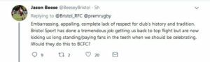 The response has been extremely… mixed. To put it politely. In fact, fans have been in uproar since their teased announcement on social media, calling themselves ‘the laughing stock of rugby’.
Despite the opening troubles it remains to be seen whether this one will float.
But what about other (in)famous sporting rebrands?
Juventus
![]() So you’re planning a major overhaul of a logo of an international football club. Perhaps things have become a little stale and you want to appeal to that pot-of-gold-at-the-end-of-a-rainbow ‘millennial’ group. Out with the old and in with the new. Something striking, modern and bold.
So you’re planning a major overhaul of a logo of an international football club. Perhaps things have become a little stale and you want to appeal to that pot-of-gold-at-the-end-of-a-rainbow ‘millennial’ group. Out with the old and in with the new. Something striking, modern and bold.
It might seem like a great idea, but it’s very easy to annoy sports fans these days, particularly in football. Italian giants Juventus, widely known as the ‘Old Lady’ due to the club’s extensive history, launched a new logo and upset fans in the process.
The club’s president, Andrea Agnelli, revealed that the logo was over a year in the making and described it as “a symbol of the Juventus way of living”. “These three elements make up the DNA of our club. The black and white stripes are the defining trait of the new visual identity and can be adapted to fit any setting.”
I’m just as flummoxed as you – it’s just two white lines, right?
As you’ll see from the two logos above, one resembles the JD Sport logo (which one quick-witted Twitter user pointed out), and the other a 120-year old football club.
Leeds United
![]() At the start of 2018, Leeds United introduced their ‘Leeds salute’, an arm gesture widely associated with the Yorkshire club and subject of many goal celebrations over the years.
At the start of 2018, Leeds United introduced their ‘Leeds salute’, an arm gesture widely associated with the Yorkshire club and subject of many goal celebrations over the years.
Seems like a great idea, right? They consulted the history of the club and worked it in to the new logo so it should be perfect. Despite the club announcing that the badge had ‘six months of research, 10,000 people consulted, ready for the next 100 years’, it looked like it had been designed by someone using Paint on Windows XP.
Leeds United fans are notoriously a passionate bunch, and the response was immediate. The power of social media once again came to the fore here, as 77,000 fans signed a petition demanding to drop the re-branded badge, that the club wisely listened to.
Cardiff City
Chinese investor Vincent Tan bought out Cardiff City FC back in 2010, and bankrolled their promotion into the Premier League for the first time in their history in 2013. However, in June 2012 the Chinese owners controversially changed Cardiff’s traditional club colours of blue, to red, a colour synonymous with good fortune in the Far East.
The fans were horrified with such a drastic change from their historic colours, particularly with their nickname of ‘The Bluebirds’ now being entirely invalid. However, as the club was moving in the right direction purely down to the investment from Vincent Tan, he was in a position of power.#
Upon Cardiff’s immediate relegation down to the Championship (perhaps red isn’t such a lucky colour after all), the pressure to change back to the previous colour of blue intensified. In January 2015, Tan relented and the unpopular red home kit was scrapped in favour of the traditional blue.
Contrast this with Manchester City, who tactically announced their rebrand (which included a more modern logo) as part of ‘a new era’ in which they revealed the hugely sought-after Pep Guardiola as their manager. It was a cleverly timed distraction from the City Group. From the fans’ perspective, they’d just appointed a world class manager and had the richest backers in the world – success will surely follow. Who cares about a badge?
London Wasps
 In July 2014, London Wasps changed their company and trading name to just ‘Wasps’ which at the time was sold as a way to appeal to a wider and global fanbase. The club had been through financial struggles and only just avoided relegation and administration in the season before, so the change came without much fanfare or even press coverage. A new owner had pulled the club from the brink of non-existence, and they only dropped one word from the name and logo and kept everything else the same, so no big deal, right?
Ah.
While at the time it was a move that seemed minor, it was in fact a well-calculated move. At the end of 2014, Wasps announced they were upping sticks from London, and moving to the Ricoh Arena all the way up in Coventry to a newly-purchased stadium.
There was a lot of criticism from fans at the time (the author being one of them), but four years down the line Wasps is now a club with one of the best squads in the country, it’s one of the few clubs that actually make a profit, and holds the record for the highest home Premiership attendance in history.
A rebrand is a minefield for marketers, especially for people working in sports marketing. But my personal experience with Wasps shows you need to have faith in your decision – nobody likes change but that doesn’t necessarily make it the wrong thing to do.
Be Bold.
It’s time to come off the fence:
How can we help you?
Message us


UK
The Warehouse, 47-49 Cowleaze Road, Kingston Upon Thames, KT2 6DZ
/// doors grants motion
Middle East
PO Box 502058 Office 1905, Aurora Tower, Dubai Media City Dubai U.A.E
/// quietest blurted filter
© Copyright. Registered in England and Wales No. 04006809